The Silk Palette: Choosing Colors that Honor the Weave

Silk is the "Magnifier of Hues." Because silk fibers are physically smoother and more reflective than cotton, every color you put on them becomes Highly Saturated. A "Navy" on cotton is just a color; a "Navy" on silk is a Vibration. In the 2026 fashion world, the choice of color on silk is a Status Move. You want "The High-Definition Palette."
The Silk Palette is your technical roadmap to choosing the hues that project the most power.
The Palette Breakdown (2026)
On a silk canvas, certain colors gain a physical "Aura":
1. The Jewel Tones (Emerald, Ruby, Sapphire)
The Impact: These colors are "Home" on silk. Because the fibers reflect light back through the dye, these hues look like liquid gems. Why: Project authority, old-world luxury, and unshakeable stability. Perfect for high-stakes social dinners and VIP festive events.
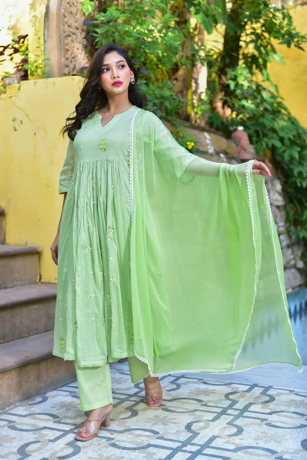
2. The Royal Neutrals (Champagne Gold, Ivory, Pearl Grey)
The Impact: These hues utilize the silk’s natural "Glow" to create a "Quiet Luxury" look. Why: Project sophistication, modernity, and a "Boutique-Bespoke" energy. Perfect for upscale gallery openings and professional social mixers.
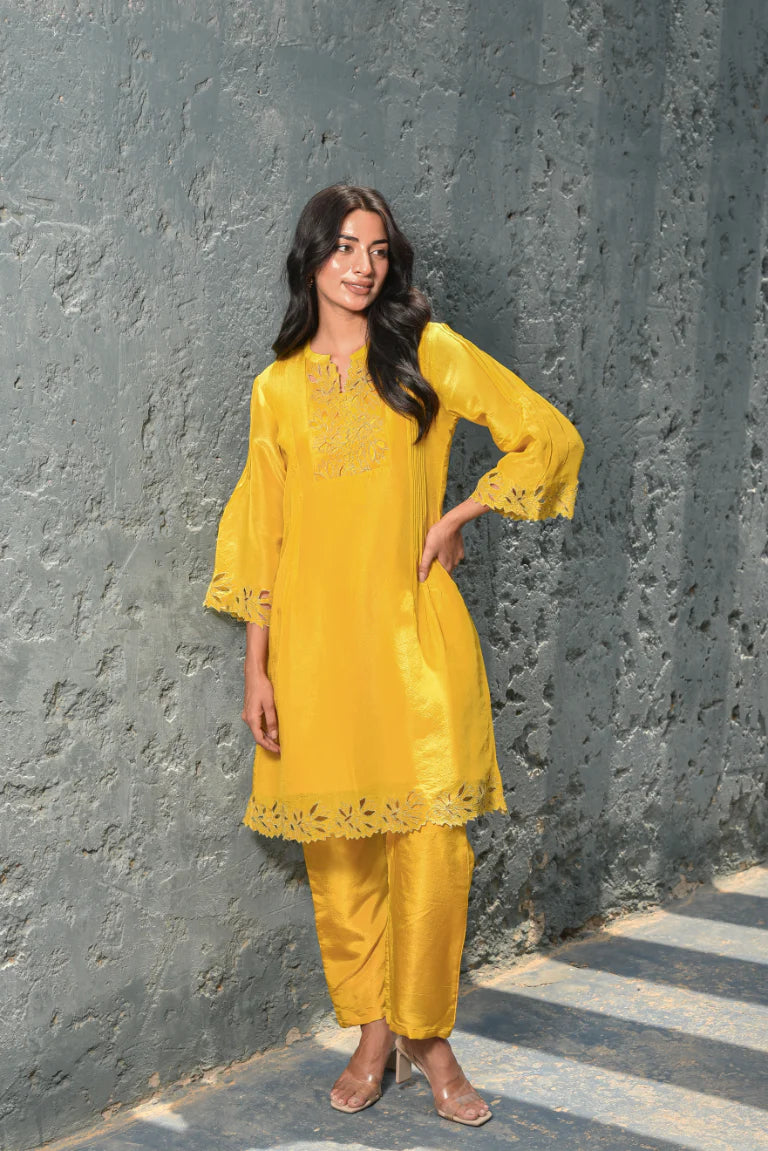
3. The Festive Neons (Saffron Orange, Hot Pink, Electric Blue)
The Impact: On silk, these high-vibrancy colors are tempered by the fabric's natural sheen, making them look "Expensive" rather than "Loud." Why: Project energy, joy, and community leadership. Perfect for festive mornings and high-energy community celebrations.
Why SAROJ JAIN Palette is more Radiant
We don't do "Flat Dyeing." Most brands use generic chemical dyes that sit on the surface of the silk. SAROJ JAIN use High-Stability Reactive Dyes that bond with the protein core of the fiber. This ensures the color is "Deep-Bonded"—it won't fade, it won't bleed, and it maintains its physical "Depth" for decades. When you move in our silk range, the color "Dances" because it’s part of the thread.
Top Palette Picks from SAROJ JAIN
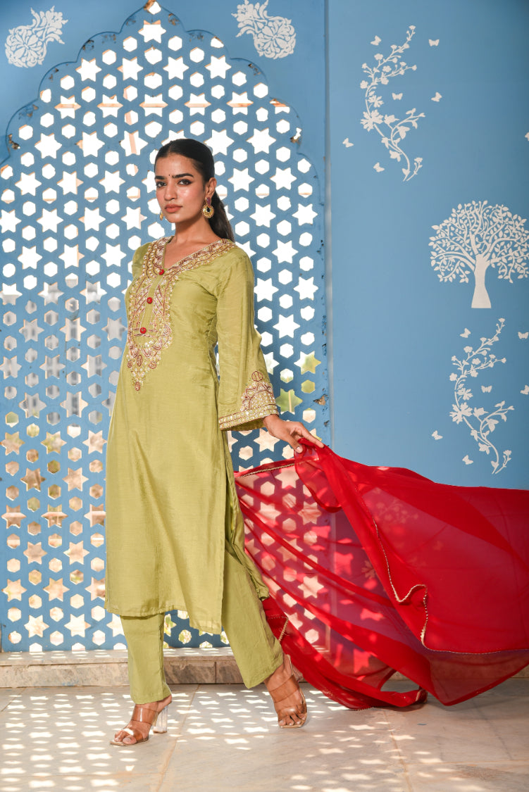
1. The "Emerald Authority" Straight Set
The definition of "Executive Majesty." The green is so deep it looks like it was harvested from a forest at midnight.
2. The "Champagne Socialite" Chanderi Set
Fresh, modern, and ultra-high-end. The natural glow of the silk makes the champagne look like a glass of vintage light.
3. The "Royal Saffron" Mulberry Anarkali
A modern tribute to the vibrant heart of the Indian festival. High impact, high status, and unbeatably beautiful.
Pro Tip: The "Lighting" Test
Before buying a silk set, look at it under Natural Sunlight and Indoor LED. A high-quality SAROJ JAIN silk will look different under both—revealing different "Undertones." In the world of high-status fashion, this "Color-Shift" is the ultimate mark of quality.
→ Explore the Silk Palette Collection
FAQs
Q: Which color is best for evening social networking? A: Stick to Dark Jewel Tones. They project the most authority and stability under artificial light.
Q: Do the colors bleed in the wash? A: Not if dry-cleaned. Our reactive dyes are highly stable, but pure silk should always be handled with the respect its royal history deserves.
Q: Why choose SAROJ JAIN for your color statement? A: Because at the top, the depth of your color reflects the depth of your taste.
Wear the light. Wear the truth.
Discover Radiant Depth → Silk Kurta Sets
Case Studies
Work-to-Dinner in a Hurry — Gurugram
Neutral co-ord + loafers by day; swap to strappy heels and cuff at night.
Wedding Guest in the Rain — Mumbai
Viscose-blend kurta set with ankle hems and rubber-soled block heels—no drags, clean photos.
Temple Ceremony Minimalism — Chennai
Plain Kanjeevaram-inspired saree, delicate gold, and low bun—elegant and respectful.
Buying Checklist
-
Shoulders clean, bust ease, hem length right for your shoes
-
Breathable lining; test arm movement and sit/stand
-
One neutral piece to mix across outfits
City Notes
- India: Pick breathable fabrics and repeatable colors.
Ready to build your look? Explore New Arrivals


